via あなたのサイトはiPhoneで見られますか? - @IT
 iPhoneや今後発売されるiPod touchに搭載されるWebブラウザのsafariの特徴はjavaやFlashをサポートしていないこと以外はPCやMacと同じ性能のフルブラウザを装備していることでしょう。

- W-ZERO3[es]:2.8" 640×480 ASV LCD(Opera Mobile/IE Mobile)
- iPhone:3.5" multi-touch LCD 480×320 pixels、160dpi(Safari)
しかし、皮肉ですよね。 iMacからは17インチモデルが無くなりデスクトップ環境のディスプレイは大型化し、モバイルの一歩先を行く携帯端末は小型化とともに高機能化してしまう。デベロッパーやデザイナーは大画面でも楽しめ・モバイル端末からのユーザも満足させるというニーズに対応しなければならない。 このBlogは一体どんな風に見えてるんだろ・・・気になる:PiPhone/iPod touchで配慮すべき特殊な事柄
- マルチタッチインターフェイスにおいて、指の幅を考慮したリンク設定。リンクが狭過ぎたり、あまりにも近い位置で隣り合っていると、うまく選択できない
- ダブルタップで拡大する要素を考慮する。画像や文字などどの要素が拡大するのか配慮し、固定サイズで埋め込んではいけない
- イメージ要素のサイズを正確に指定する(例えば、10×10のイメージ要素に100×100のイメージを使わない)
- 背景イメージは小さなものを並べて使う。1枚の大きなイメージを使わない
- フレームセットを使わない
- フォームを使うときには、入力時に表示領域が自動的に拡大すること配慮する。ソフトウェアキーボードを利用することによる画面下部が占有されることも配慮する
- 負荷の掛かる、動き続けるJavaScriptは使わない(実行に時間がかかり過ぎる場合はTimeoutする場合もあり)
- ポップアップ画面での操作は避ける(デフォルトではブロックされていて表示できない)
- mouse overイベントは使えない。tooltipは使えない
- HTMLは文法的に正しいものになっているように
- HTML、CSS、JavaScriptは別々なファイルに、機能ごとに細かく分割して扱う。必要のないCSSやJavaScriptは読み込まないようにする
iPhone and as for the feature of safari of the Web browser which is loaded onto iPod touch which in the future is sold other than of the thing which does not support java and Flash as PC and Mac probably is to equip the full browser of the same efficiency.
* W-ZERO3 [es]: 2.8 " 640×480 ASV LCD (Opera Mobile/IE Mobile)
* iPhone: 3.5 " multi-touch LCD 480×320 pixels and 160dpi (Safari)
To be unexpected, resolution it is lower than W-Zero.
By the way up-to-date Advanced/W-ZERO3 [es] resolution is the 480×800 dot. As for the efficiency of Opera Mobile8.7 which is loaded you do not understand, but under present conditions safari which is loaded onto iPhone and the like probably is the high performance.
Unless it tries obtaining iPhone really, you do not understand it is visible in some wind, but the environment which emulation is done already certain is like. In Mac.
Marketcircle: iPhoney
If, the person of Windows using safari Beta of Windows edition, drops resolution to the 480×320, as for feeling you can taste whether!?
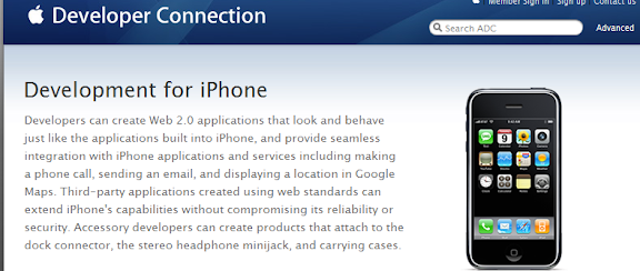
Apple itself in for iPhone and iPod touch has issued the guideline.
Apple Developer Connection - Web Development for iPhone
The special matter which it should consider with iPhone/iPod touch
* In multiple touch interface, the link setting which considers the width of the finger. Link is too narrow, when it has been adjacent even at excessively close position, it cannot select well
* The element which is expanded with the double tap is considered. Whether some element such as picture and letter expands you consider, at fixed size do not have to imbed,
* For example size of the image element is appointed accurately (, image of the 100×100 is not used in the image element of the 10×10)
* Arranging small ones, you use background image. The big image 1 is not used
* Frame set is not used
* When using form, when inputting the indicatory territory expanding automatically you consider. You consider also the fact that the picture lower part due to utilizing the software keyboard is possessed
* You do not use JavaScript which load catches, continues to move when (time is required for execution too much, when Timeout it does, it is)
* You avoid the operation in the popup picture, (with default being blocked, it cannot indicate)
* You cannot use the mouse over event. You cannot use tooltip
* As for HTML as become grammatically correct ones,
* In the separate file, dividing every function finely, it handles HTML, CSS and JavaScript. Try CSS and JavaScript there is no necessity not to read
But, it is sarcasm, don't you think?.
17 inch model is gone from iMac and it enlarges the display of desktop environment, ahead the Mobile one step the portable terminal which goes functionates with miniaturization high. The developer and the designer must correspond to the needs that also the user from the enjoys Mobile terminal makes be satisfied even in the large picture.
This Blog just how probably is to have been visible,… it becomes matter of concern: - P
by Google Translate